
Visitor Management analytics helps administrators understand how visitors move through the office, how many registered visits turn into arrivals, and when reception teams should expect the busiest periods.
Accessing Visitor Management analytics
To access the report, go to Visitor Management → Analytics.
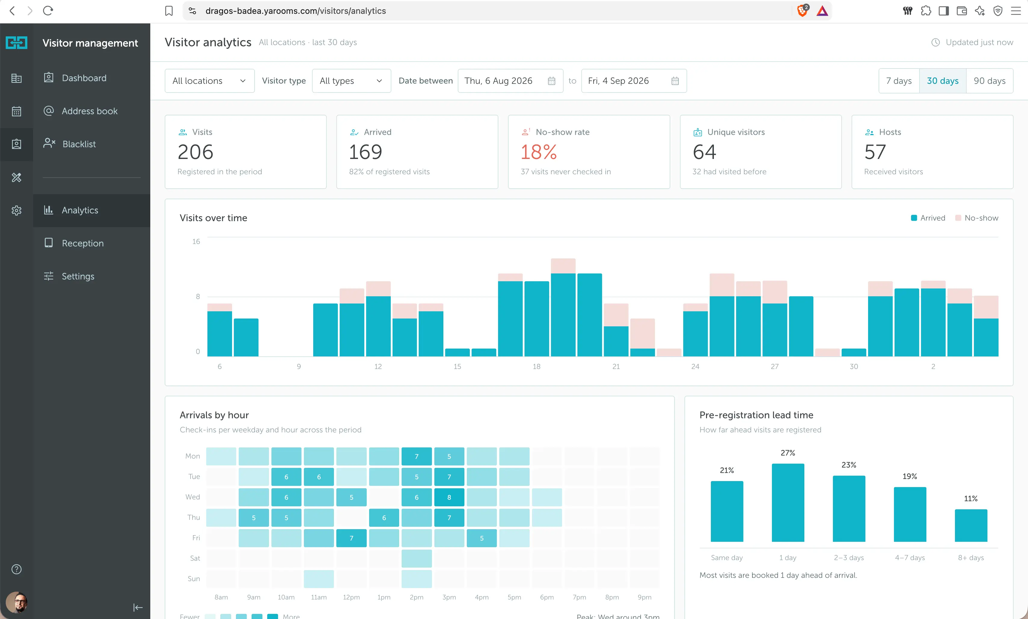
Filtering the report
Use the filters at the top of the page to narrow the report:
- Location: View all locations or focus on one office.
- Visitor type: Filter by all visitor types or a specific visitor type.
- Date between: Choose a custom date range.
- Quick range: Switch between 7 days, 30 days, and 90 days.
The report updates after the selected filters are applied.
Reading the charts
Use the charts and widgets to understand what happened during the selected period, where visits happened, and what patterns your reception team should prepare for.
Summary cards
The cards at the top give you a quick health check for the selected filters.

- Visits: The total number of visits registered in the selected period.
- Arrived: The number of registered visits that actually checked in. This helps you compare scheduled visits with real arrivals.
- No-show rate: The share of registered visits that never checked in. In the example, 19 visits never checked in, which creates a 37.3% no-show rate.
- Unique visitors: The number of different people who visited, with a note about how many had visited before.
- Hosts: The number of employees who received visitors.
Use these cards first. They tell you whether visitor traffic is high, whether people are arriving as expected, and how many employees are receiving visitors.
Visits over time
This chart shows daily visit volume across the selected period.
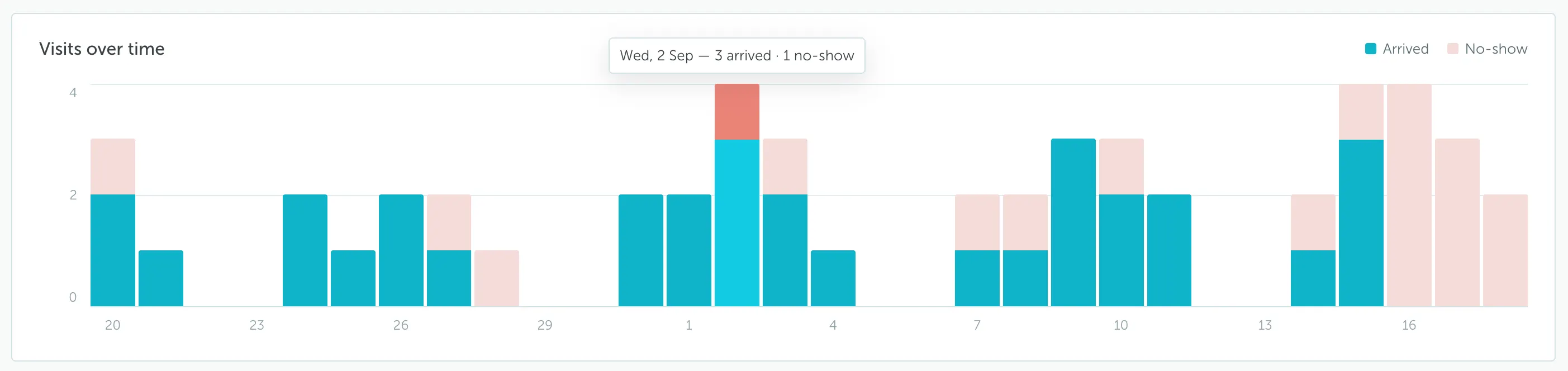
Each bar represents a day. Teal shows visits that arrived, while the light pink segment shows no-shows. Hovering a bar shows the exact count for that day. In the example, Wednesday, 2 Sep had 3 arrived visits and 1 no-show.
Use this chart to spot busy days, slow days, and days where no-shows were unusually high.
Arrivals by hour
This chart shows when visitors usually check in, grouped by weekday and hour.
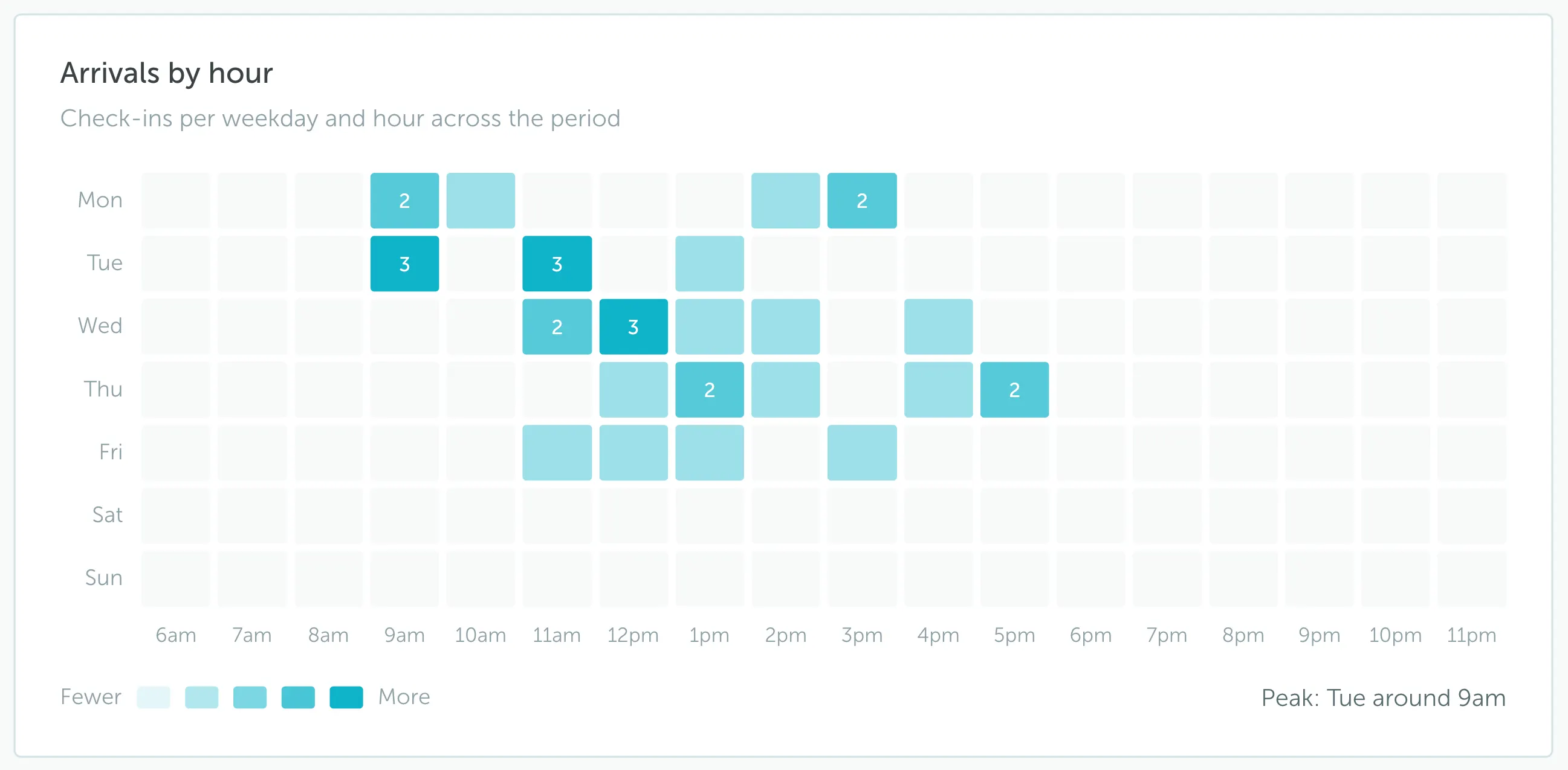
Darker cells mean more check-ins happened at that time. In the example, the peak is Tuesday around 9am. The chart also shows activity around late morning and early afternoon on several weekdays.
Use this chart to plan reception coverage by time of day. For example, if Tuesday at 9am is consistently busy, you may want front-desk staff ready before that time.
Pre-registration lead time
This chart shows how far ahead visits are usually registered.
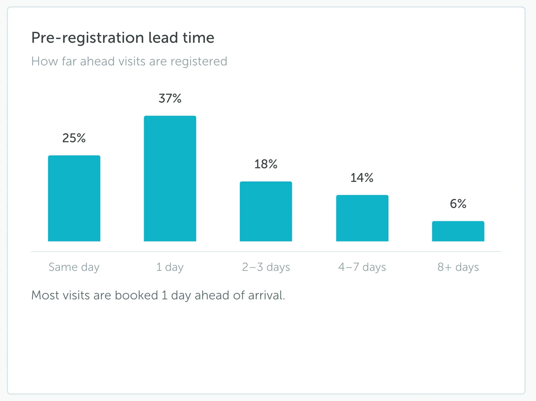
The bars group visits by how early they were created before arrival: same day, 1 day, 2-3 days, 4-7 days, and 8+ days. In the example, most visits were booked 1 day ahead of arrival, while same-day registrations made up another large group.
Use this chart to understand how much preparation time your reception team usually has. If many visits are same-day, reception may need a faster process for badges, visitor instructions, and security checks.
Location, visitor type, and repeat visitor widgets
These widgets explain who visited, what type of visitor they were, and whether they had been seen before.
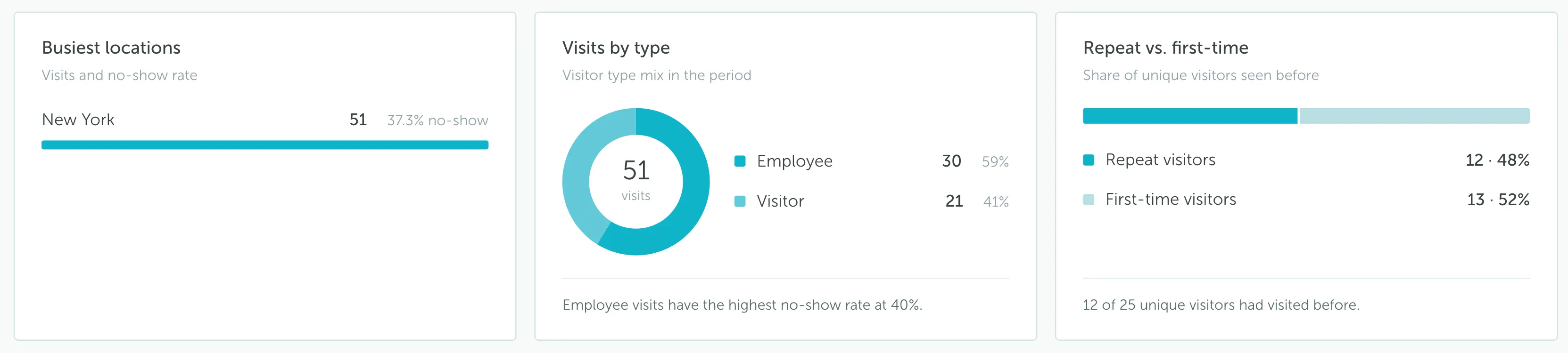
- Busiest locations: Shows visit volume and no-show rate by location. If only one location has Visitor Management enabled, this widget shows that location only.
- Visits by type: Splits visits by visitor type. The note below the chart highlights the visitor type with the highest no-show rate, so admins can quickly see which group needs attention.
- Repeat vs. first-time: Shows whether your unique visitors had visited before. In the example, the split is almost even between repeat and first-time visitors.
Use these widgets to answer basic operational questions, such as which location is busiest, whether most traffic comes from employees or external visitors, and how many guests are new to your office.
Capacity, hosts, and companies
These widgets help you understand busy moments, who receives the most visitors, and which companies visit most often.
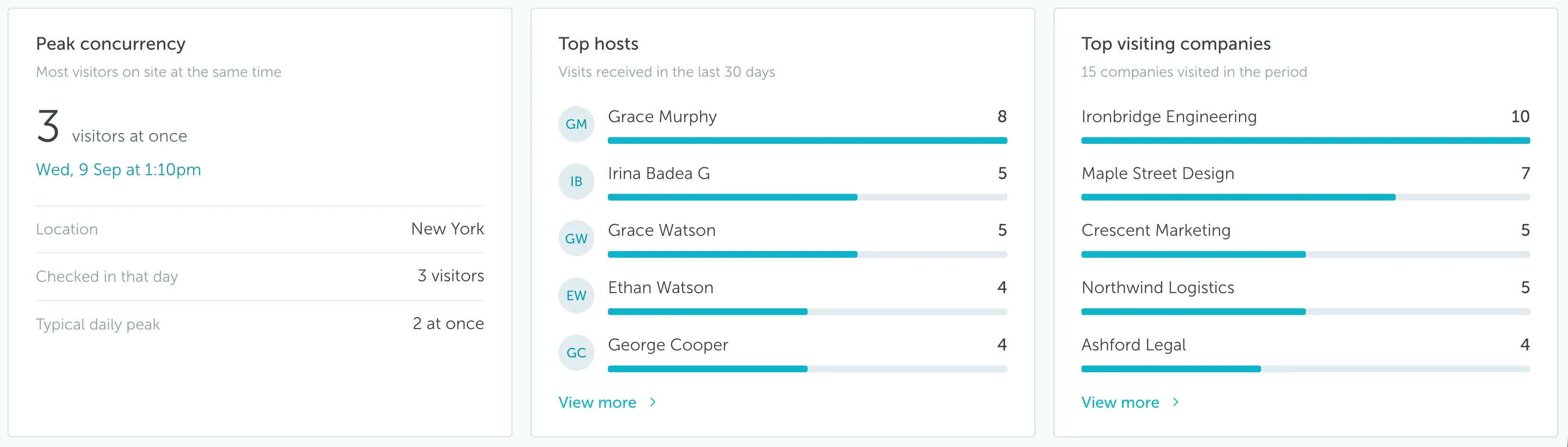
- Peak concurrency: Shows the highest number of visitors checked in at the same time. In the example, the peak was 3 visitors at once on Wednesday, 9 Sep at 1:10pm.
- Top hosts: Shows which employees received the most visits. This is useful when you need to understand which teams or people generate the most front-desk traffic.
- Top visiting companies: Shows which visitor companies appeared most often. In the example, Ironbridge Engineering was the most frequent visiting company.
Use these widgets to plan front-desk coverage, identify teams that receive many visitors, and understand which external companies are visiting frequently.