
Jump to:
Workplace analytics brings together space utilization, booking activity, check-ins, no-shows, and office satisfaction. Use the dashboard to identify busy periods, compare floors and space types, and understand whether reserved spaces are being used as expected.
Accessing and filtering the dashboard
Go to Workplace → Analytics. The dashboard combines the main workplace metrics on one page, with View details links for exploring individual reports.
Use the filters at the top to choose what you want to review:
- Location: Select the office you want to analyze.
- Floor: Focus on one floor or keep All floors selected for a location-wide view.
- Space type: Compare a specific type, such as desks or meeting rooms, or keep All space types selected.
- More filters: Open the additional filtering options to narrow your selection further.
- Date range: Choose the reporting period using the date selector on the right, shown as Last 30 days in the example below.
The header shows the selected location and period. Check these before comparing results or opening a detailed report.
Note: The Data through date shows how recent the reporting data is. It may be earlier than the end of your selected range. The In the office today widget also has its own day selector, so read its date separately from the main reporting period.
Summary and utilization over time
The four summary cards give you an overview of activity within the selected filters.
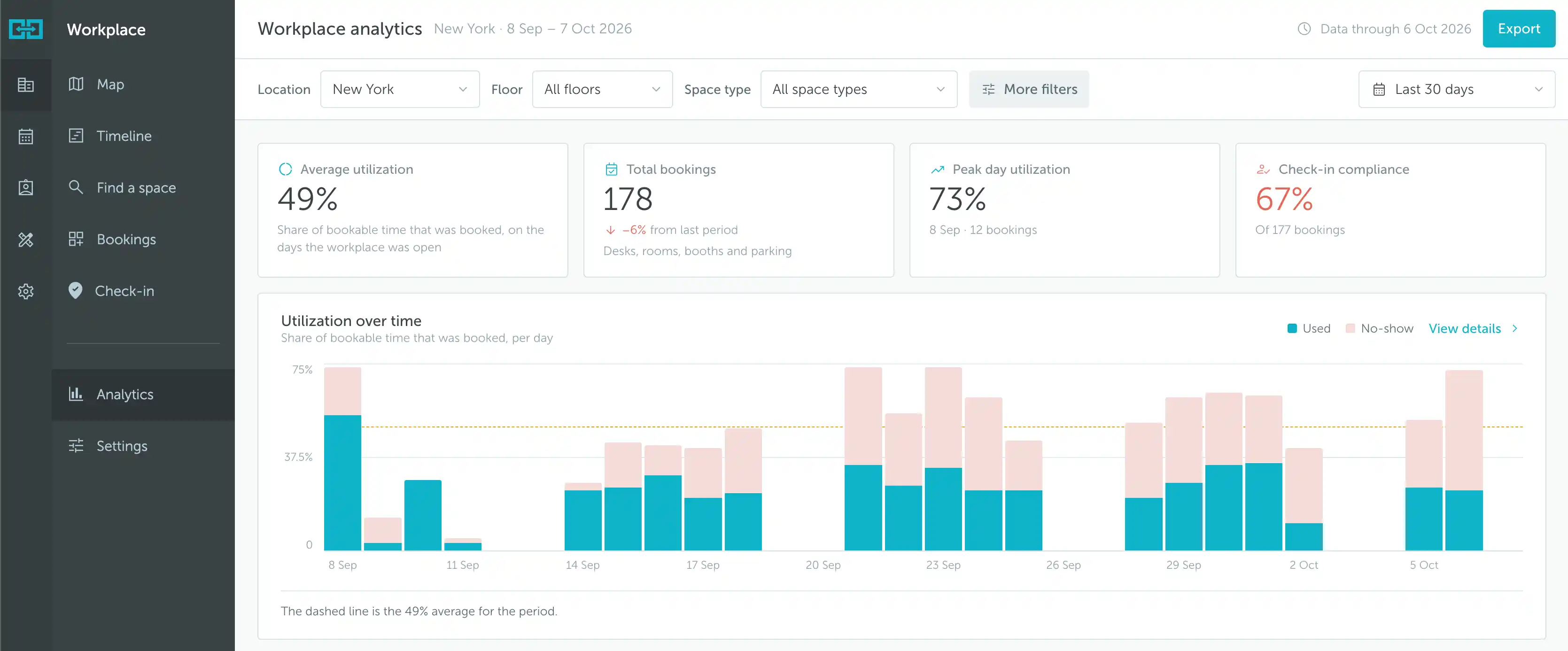
- Average utilization: The share of bookable time that was booked on days when the workplace was open. This measures time reserved, rather than simply counting how many spaces received a booking.
- Total bookings: The number of bookings in the selected scope and period. A comparison with the previous period may appear below the total.
- Peak day utilization: The highest daily utilization in the period, together with its date and booking count.
- Check-in compliance: The percentage of bookings recorded as checked in. Read the booking count beneath the percentage alongside it, rather than assuming that every dashboard metric uses the same total.
In the example, average utilization is 49%, with 178 bookings and a peak day of 73%. These figures describe different aspects of activity: a high booking count does not necessarily mean a high share of bookable time was reserved, because booking lengths can differ.
Utilization over time
Each bar represents a day. The chart separates Used in teal from No-show in light pink, while the dashed line marks the average utilization for the period.
Use this chart to spot unusually busy days, quieter periods, and days with a large no-show share. Click View details to explore the information behind the chart.
Read utilization together with check-in compliance and no-shows. Booked time indicates demand for spaces, but it is not, on its own, proof of physical attendance. For consistent attendance data, review your check-in settings and make sure people know how to check in.
Occupancy and booking patterns
The next group of widgets breaks the overall results down by hour, weekday, floor, and space type.
Occupancy by hour
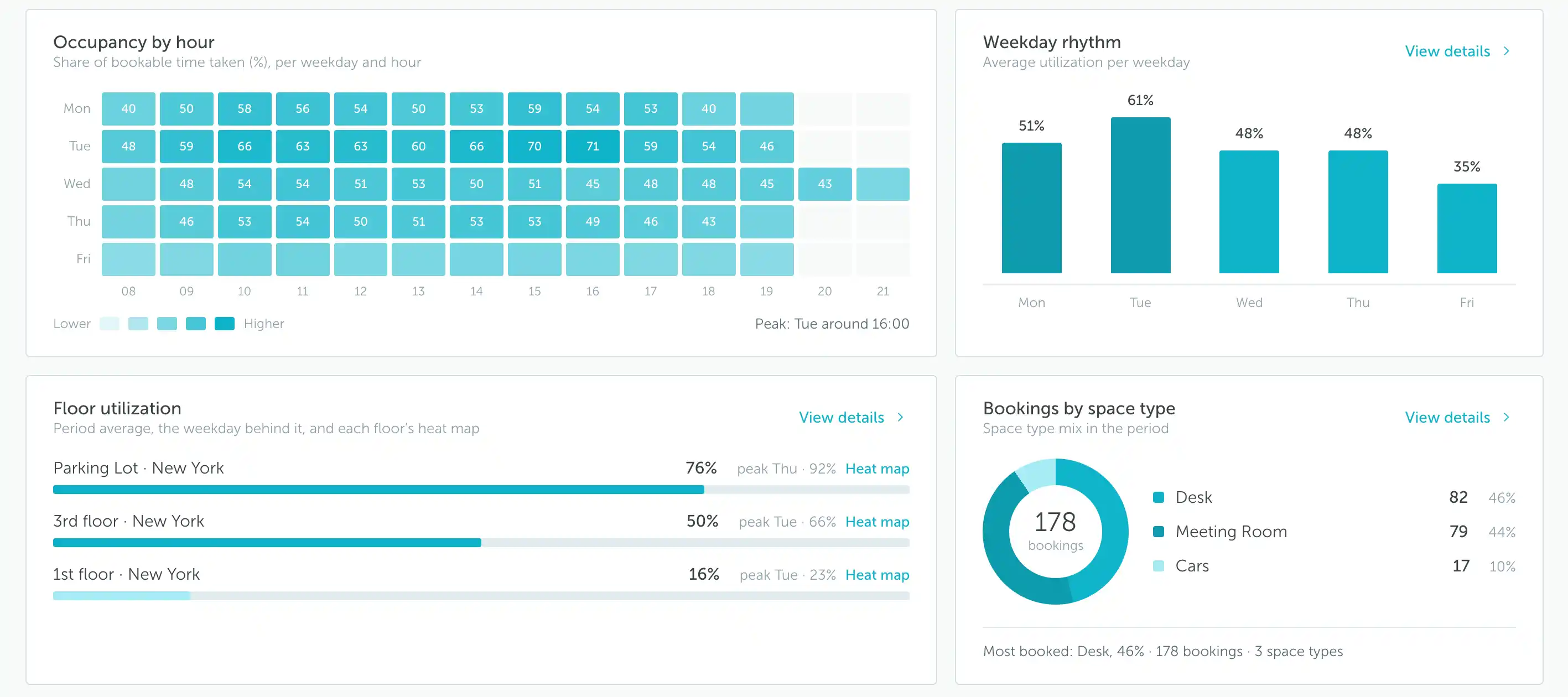
This grid shows the share of bookable time taken for each weekday and hour. Darker teal cells indicate higher utilization; lighter cells indicate lower utilization. The note below the grid identifies the peak time.
In the example, Tuesday around 16:00 is the busiest point. This view helps distinguish an office that is busy throughout the day from one where demand concentrates into a few hours.
Despite the title, this is a booking-based view of utilization, not a live count of people detected in the office.
Weekday rhythm
The bars show average utilization for each weekday. Here, Tuesday averages 61%, while Friday averages 35%. Use this comparison to identify recurring weekly patterns rather than judging demand from a single busy date.
Click View details for the weekday breakdown described below.
Floor utilization
Each row shows a floor’s average utilization, its peak weekday and percentage, and a Heat map link. This makes it easier to see whether demand is concentrated on one floor while other areas are used less often.
Bookings by space type
The donut chart divides bookings between the selected space types. The list shows both the booking count and its share of the total. In this example, desks account for 82 bookings (46%), meeting rooms for 79 (44%), and cars for 17 (10%).
These percentages describe the mix of bookings, not the utilization of each space type. A type can account for many short bookings without taking up the largest share of bookable time. Use the Space type filter to examine its utilization separately, or click View details to explore the booking breakdown.
Weekday rhythm details
Click View details in the Weekday rhythm widget to open the detailed report.
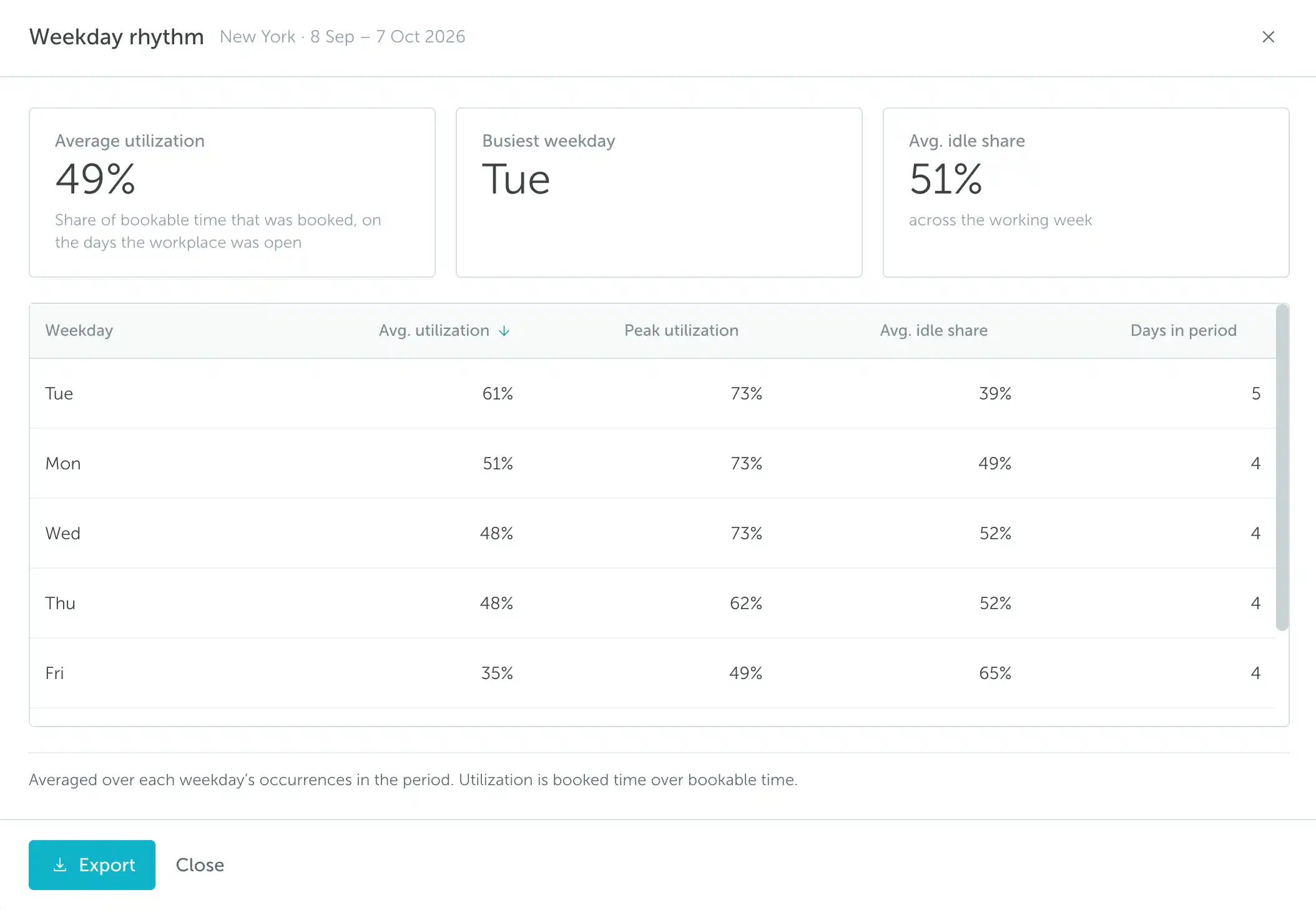
The summary shows Average utilization, the Busiest weekday, and Avg. idle share across the working week.
The table adds the following information for each weekday:
- Avg. utilization: Utilization averaged over occurrences of that weekday in the selected period.
- Peak utilization: The highest utilization recorded for that weekday within the period.
- Avg. idle share: The average share of bookable time left unbooked.
- Days in period: How many occurrences of that weekday fall within the reporting period.
For example, the five Tuesdays shown have an average utilization of 61%, a peak of 73%, and an average idle share of 39%. The average describes the usual pattern; the peak highlights the busiest occurrence.
Compare periods with similar working schedules, and check Days in period before interpreting differences between weekdays. An extra occurrence of a weekday or a different location schedule can affect the context of the comparison.
Floor utilization and heat maps
Click View details in the Floor utilization widget to compare floors in more detail.
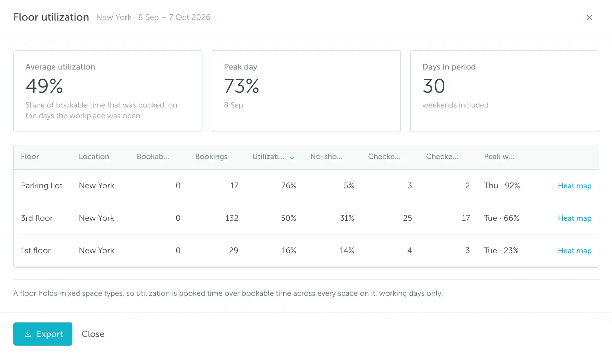
The summary includes average utilization, the peak day, and the number of days in the period. The table brings together booking counts, utilization, no-show information, check-in/out figures, and peak weekday information for each floor.
A floor may contain several space types. Its utilization represents booked time divided by bookable time across its spaces, on working days, rather than a simple count of desks or rooms.
In this example, the Parking Lot averages 76% utilization, compared with 50% on the 3rd floor and 16% on the 1st floor. This suggests different levels of demand, but check the space types and available hours before treating the floors as directly equivalent.
Opening a heat map
Click Heat map beside the floor you want to inspect, either in the dashboard widget or in the detailed floor report. The heat map provides a spatial view of utilization, helping you identify which parts of the office are used more or less often.
Use the floor comparison to identify where to investigate, then the heat map to understand the pattern within that floor. This is useful when considering changes to the office layout or the balance of available spaces.
Note: The floor report's Days in period includes weekends, while utilization is based on bookable time on working days. Do not interpret the period length as the number of days the office was open.
Presence, no-shows, and satisfaction
The lower part of the dashboard connects booking activity with check-ins and feedback from people who were in the office.
In the office today
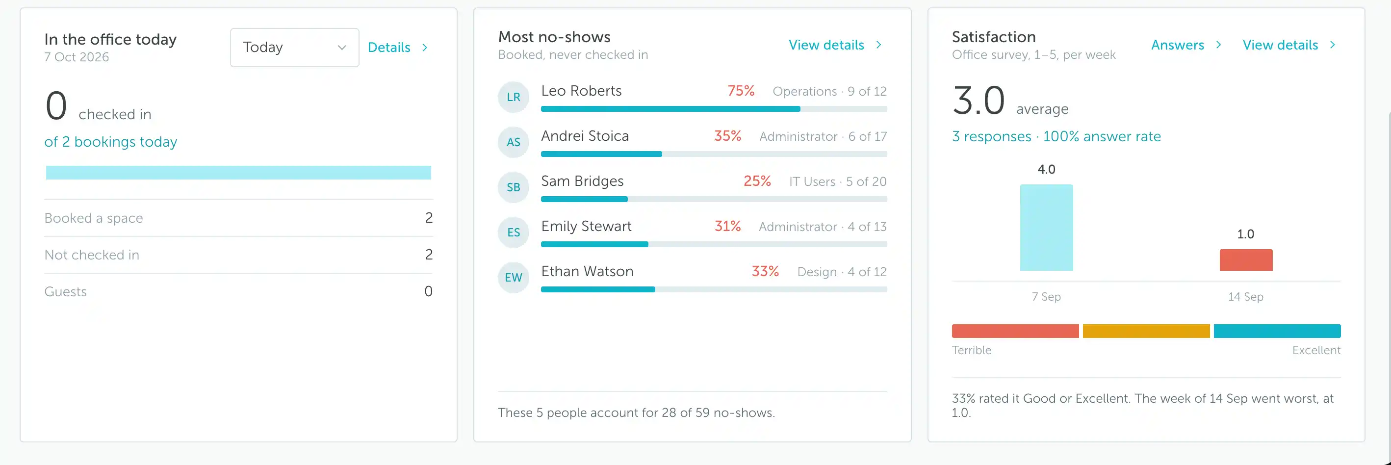
This widget shows the check-in figure for the displayed day, alongside booking information and rows for Booked a space, Not checked in, and Guests. Use the day selector to change the day being reviewed, and Details to explore the underlying records.
In the example, there are 2 bookings today and 0 checked in. The bookings indicate planned use; the check-ins indicate recorded arrivals. Someone who has not checked in yet should not automatically be treated as a no-show while their booking is still upcoming.
Most no-shows
This widget highlights people with the most no-shows. Each entry includes the person’s team, a no-show percentage, and the number of no-shows relative to their bookings. The footer summarizes how many of the period’s no-shows are associated with the displayed people.
For example, 9 of 12 corresponds to a 75% no-show rate. Look at the count as well as the percentage: a high percentage based on a few bookings is different from a recurring pattern across many reservations.
Click View details to open No-shows and check-in behaviour.
Satisfaction
The Satisfaction widget summarizes office survey responses on a 1 to 5 scale, from Terrible to Excellent. It includes the overall average, response count, answer rate, and weekly average scores. The text below the chart highlights additional results, such as the share of Good or Excellent ratings and the lowest-scoring week.
Use Answers to review responses and View details to explore the satisfaction report. For setup instructions, see How to set up a satisfaction survey.
In the example, the average is 3.0 from 3 responses. Always consider the response count alongside the score: an average based on a small number of answers may not represent the wider office experience.
No-shows and check-in behaviour
This detailed report brings together booking and check-in information by person.
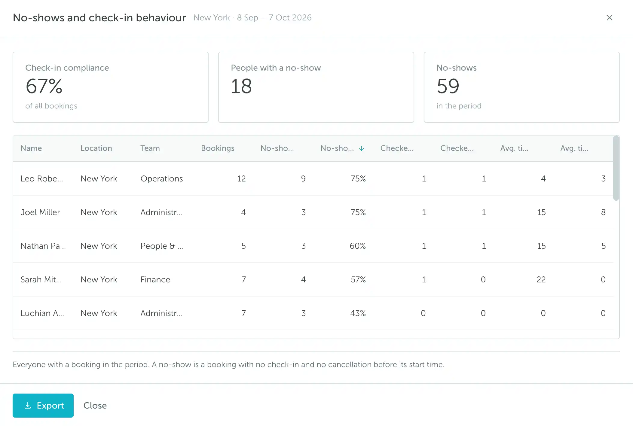
The summary cards show:
- Check-in compliance: The percentage of bookings recorded as checked in.
- People with a no-show: The number of people with at least one no-show in the period.
- No-shows: The total number of no-show bookings in the period.
The table lists people with bookings in the selected period, with their location, team, booking count, no-show count and percentage, and check-in/out information. It provides the context needed to investigate a dashboard total at an individual level.
The report defines a no-show as a booking with no check-in and no cancellation before its start time. In the example, 59 no-shows are associated with 18 people. Those are different measures: one person can have multiple no-shows.
Use this information to identify recurring booking habits and follow up on check-in practices. Before drawing conclusions about attendance, consider whether people are consistently using the configured check-in process.
Exporting reports
Use Export at the top of the dashboard to access its export action. The detailed Weekday rhythm, Floor utilization, and No-shows and check-in behaviour reports also have an Export button at the bottom of the window.
- Select the location, reporting period, and other relevant filters.
- Review the results and the Data through date.
- Open the detailed report if you want to export that breakdown.
- Click Export in the view you are reviewing.
Check the location and period displayed in the report header before sharing an export, especially when comparing results from several offices or reporting periods.