
Jump to:
Services analytics brings together service demand, costs, delivery outcomes, tickets, and cleaning activity. Use it to see which services people request, how much notice your team receives, and where operational issues need attention.
Unlike the Services Dashboard, which helps teams manage individual requests, analytics shows patterns across a reporting period.
Accessing and filtering the dashboard
Go to Services → Analytics. The header shows the selected location, reporting period, and service request count.
Use the filters at the top to focus your analysis:
- Location: Select the office you want to review.
- Service type: Focus on shared services or physical resources, or keep All service types selected.
- Service category: Narrow the results to a category or keep All service categories selected.
- More filters: Open the additional filtering options.
- Date range: Choose the reporting period using the date selector on the right, shown as Last 30 days in the example.
Check the Data through date in the header to see how recent the reporting data is. A selected date range does not necessarily mean all activity up to its end has already been included.
Note: Costs are shown only when a single location is selected, in that location's currency. If cost figures are missing, check the location selection before interpreting the result as zero spending.
Summary and service requests over time
The five summary cards provide an overview of service activity and operational follow-up.
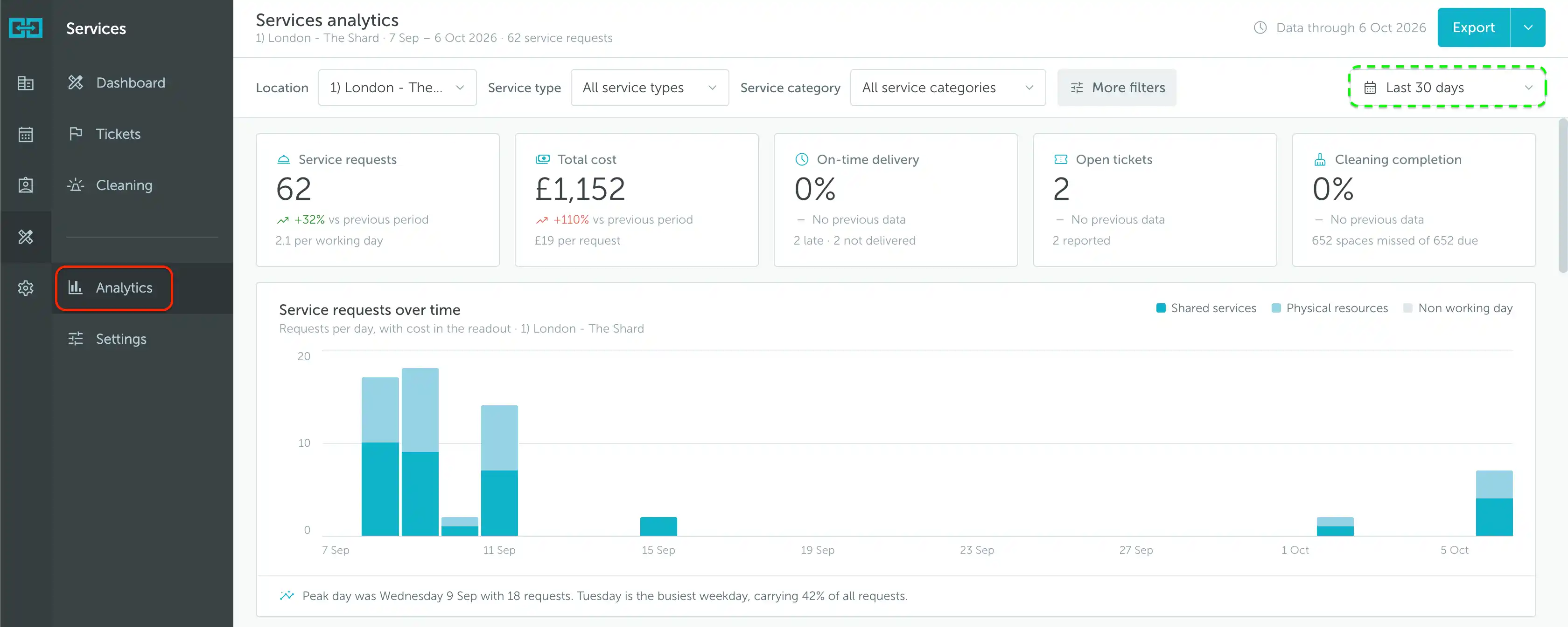
- Service requests: The number of requests in the selected scope and period, with a per-working-day figure and a comparison against the previous period when available.
- Total cost: The reported cost of the services, with a cost-per-request figure and period comparison when available.
- On-time delivery: The percentage recorded as delivered on time, with counts of late and undelivered requests below it.
- Open tickets: The number of tickets still open, alongside the number reported.
- Cleaning completion: The percentage of due cleaning recorded as completed, with the number missed out of those due.
In the example, there are 62 service requests with a total cost of £1,152. Requests increased by 32%, while cost increased by 110% compared with the previous period. Reading these together helps identify changes in spending that are not explained by request volume alone.
If a card says No previous data, there is no comparison shown. This is different from a 0% change.
Service requests over time
The stacked bars show requests per day, split into Shared services and Physical resources. The legend also identifies Non working day shading. The chart’s readout includes cost information, while the summary below highlights the peak date and busiest weekday.
In this example, the peak date has 18 requests, while Tuesday accounts for 42% of all requests across the period. The busiest individual date and busiest weekday answer different questions: one identifies a single spike, while the other highlights a recurring weekly pattern.
Use this chart to plan service coverage around busy periods and see whether demand is mainly for shared services, physical resources, or both.
Delivery, lead time, and requesters
The next group of widgets explains how requests were fulfilled, how early they were made, and who requested them.
Delivery status
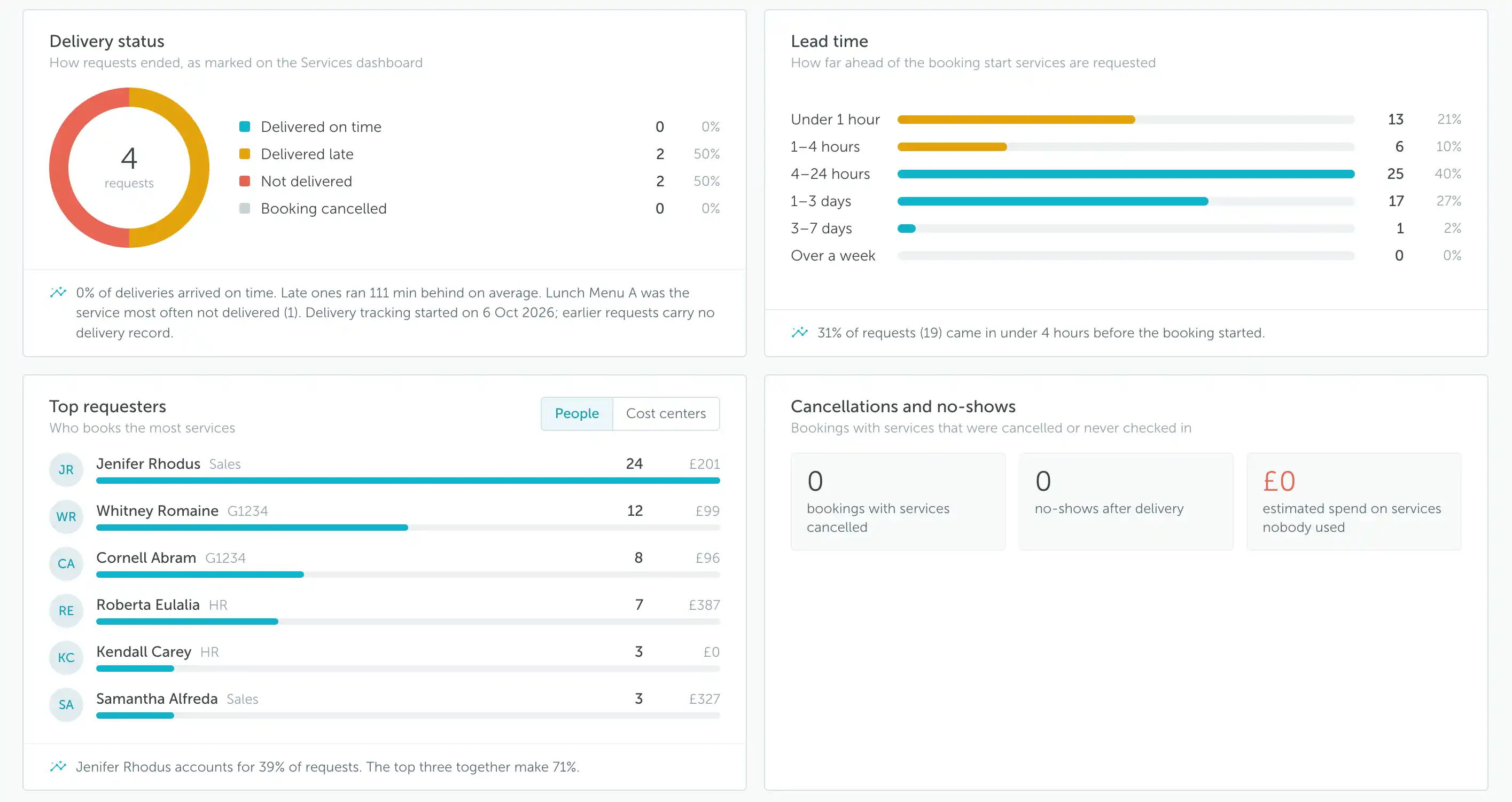
This chart groups requests by their recorded outcome on the Services Dashboard:
- Delivered on time
- Delivered late
- Not delivered
- Booking cancelled
Each outcome has a count and percentage. The summary below the chart can highlight the average delay, the service most often not delivered, and the date delivery tracking started.
In the example, the chart contains 4 requests: 2 delivered late and 2 not delivered. This is fewer than the 62 service requests in the main summary because the screenshot explicitly notes that earlier requests have no delivery record.
Check the delivery tracking start date before comparing delivery outcomes with total requests. Requests from before tracking began do not automatically have a delivery record. Keep delivery statuses updated in the Services Dashboard so the report reflects the outcomes your team records.
Lead time
Lead time shows how far ahead of the booking start services were requested. The chart groups requests into Under 1 hour, 1–4 hours, 4–24 hours, 1–3 days, 3–7 days, and Over a week.
Each row includes a count and its share of requests. In the example, 19 requests (31%) arrived less than four hours before the booking started.
Use this information to understand preparation time. A large share of last-minute requests can help explain operational pressure even when overall request volume is modest. Lead time measures advance notice, not how long delivery took.
Top requesters
Switch between People and Cost centers to review who generates the most service demand. The People view shows request counts and costs alongside each person, with a summary of how concentrated demand is among the leading requesters.
Compare both measures: the person with the most requests is not necessarily the person with the highest associated cost. This helps distinguish frequent low-cost requests from less frequent, more expensive ones.
Cancellations and no-shows
This widget highlights bookings with services that were cancelled or never checked in. It shows:
- Bookings with services cancelled
- No-shows after delivery
- Estimated spend on services nobody used
Use it to identify potential waste associated with cancelled bookings or services delivered for bookings that became no-shows. The spend figure is an estimate based on the recorded activity, not a separate invoice or refund total.
Services and cost centers
The Services table provides a more detailed breakdown. Switch between By service and By cost center depending on whether you want to review individual services or cost allocation.
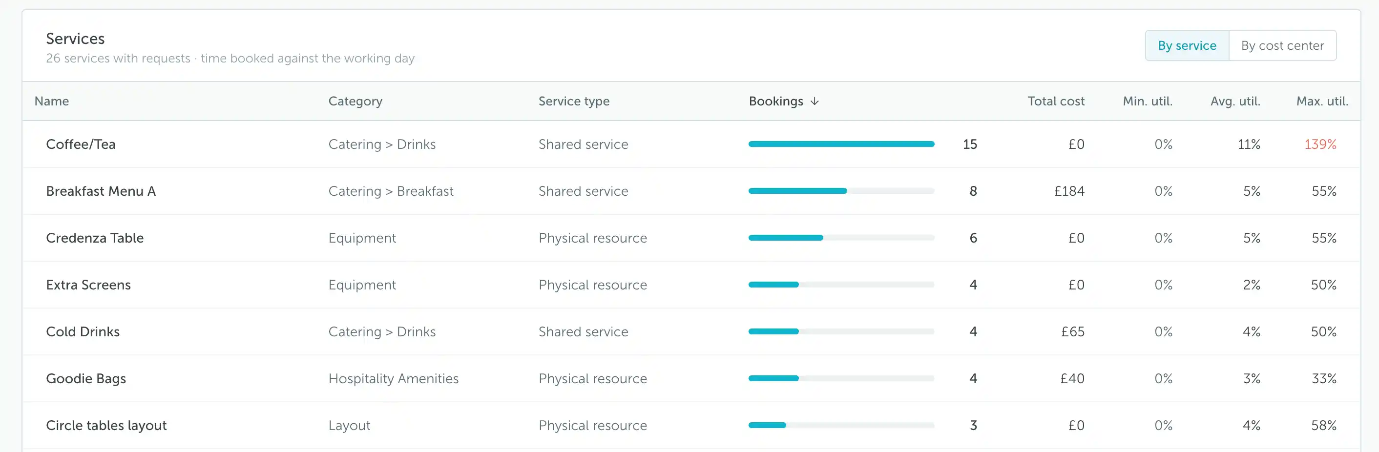
In By service, the table shows:
- Name: The service being requested.
- Category: Its category, including the subcategory path where applicable, such as Catering > Drinks.
- Service type: Whether it is a shared service or physical resource.
- Bookings: How many bookings include the service.
- Total cost: The reported cost associated with the service.
- Min. util., Avg. util., and Max. util.: Minimum, average, and maximum utilization in the reporting period.
Utilization is the share of the working day a service was booked for. It is not a delivery success rate. The dashboard notes that values above 100% mean the service was booked beyond the working day, so a value such as 139% should not be read as a percentage of successful deliveries.
For example, Coffee/Tea has more bookings than Breakfast Menu A in the screenshot, but Breakfast Menu A has a higher reported cost. Use the table to compare volume, cost, and time booked rather than relying on just one ranking.
For information about organizing services into categories and subcategories, see How to configure workplace services.
Ticket analytics
The Tickets section summarizes reported workplace issues and the time taken to resolve them.
Tickets by category and priority
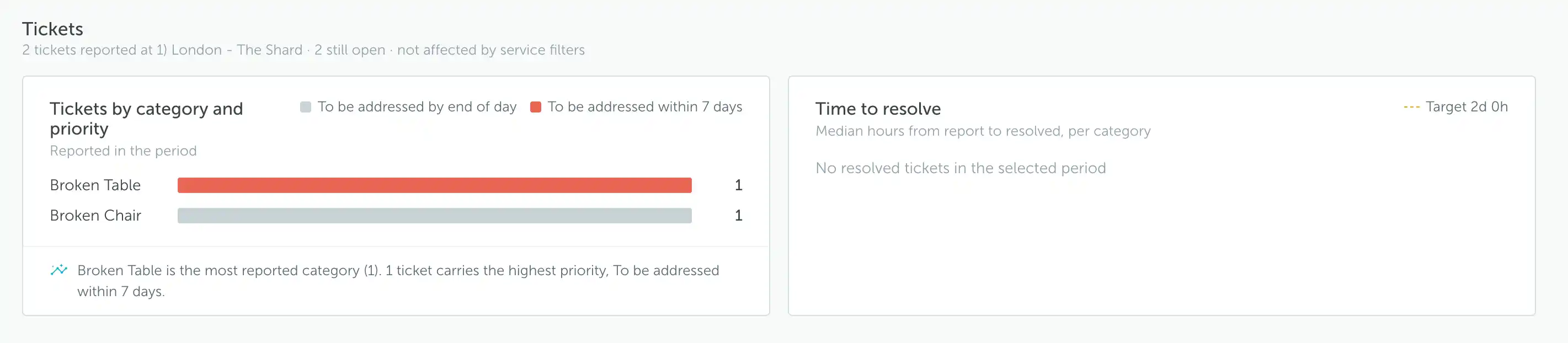
This chart groups tickets reported in the period by category, with colors identifying their configured priorities. The summary helps identify frequently reported issues and tickets requiring attention.
The example contains one Broken Table ticket and one Broken Chair ticket. Priority labels reflect the configuration used in the account, so read the legend rather than assuming the colors have the same meaning in every workplace.
Time to resolve
This chart measures the median hours from report to resolution, grouped by category. The displayed target provides a reference for comparing resolution times.
If no tickets were resolved during the selected period, the chart shows No resolved tickets in the selected period. This does not mean that issues were resolved instantly or that there were no open tickets.
Note: The Tickets section is not affected by service filters. Narrowing the service type or category does not narrow the ticket statistics in the same way. Check the location and ticket summary when reviewing these results.
To manage the underlying issues, see Ticketing Center.
Cleaning and recurring issues
The Cleaning section uses the daily cleaning checklist to show completion by floor and highlight spaces with repeated operational issues.
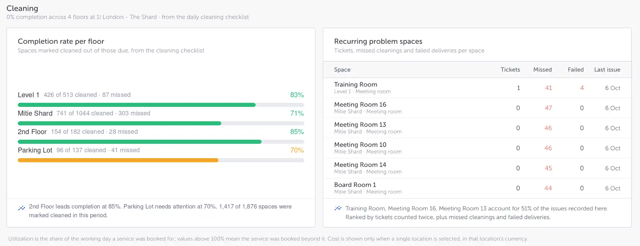
Completion rate per floor
Each row shows how many spaces were marked cleaned out of those due, the missed count, and the completion percentage. Use the floor-level results to identify where follow-up is needed rather than relying only on an overall completion figure.
These figures come from recorded checklist activity. Across a reporting period, a space can be due for cleaning repeatedly, so the totals should not be interpreted as the number of unique desks or rooms on the floor.
A missed checklist entry means cleaning was not recorded as completed. Before concluding that a space was left uncleaned, check whether the team is consistently marking completed work in the cleaning checklist.
Recurring problem spaces
This table brings together several types of issue for each space:
- Tickets: Reported issues associated with the space.
- Missed: Missed cleaning entries.
- Failed: Failed service deliveries.
- Last issue: The date of the most recent recorded issue.
The row also identifies the floor and space type. The ranking shown in the screenshot counts tickets twice, then adds missed cleanings and failed deliveries. It is therefore a combined prioritization view, not simply a list sorted by ticket count.
Use it to spot spaces that need a closer review across multiple operational processes. For example, a room appearing with both repeated missed cleanings and failed deliveries may need coordination between teams rather than a single isolated fix.
Exporting reports
Use Export in the top-right corner of the dashboard. The adjacent dropdown provides access to additional export options.
- Choose the location and reporting period.
- Apply the relevant service filters.
- Review the results and the Data through date.
- Use Export, or open its dropdown to review the available options.
Before sharing results, check the selected currency, the delivery tracking period, and whether the figures refer to service requests, tickets, or cleaning activity. These sections describe different operational measures and should not be treated as interchangeable totals.