
Jump to:
Calendar analytics shows how people divide their time between the office, working from home, and time out of office. Use it to identify recurring weekly patterns, compare locations, and understand how consistently people set their work status.
The screenshots in this article use illustrative demo data.
Accessing and filtering the dashboard
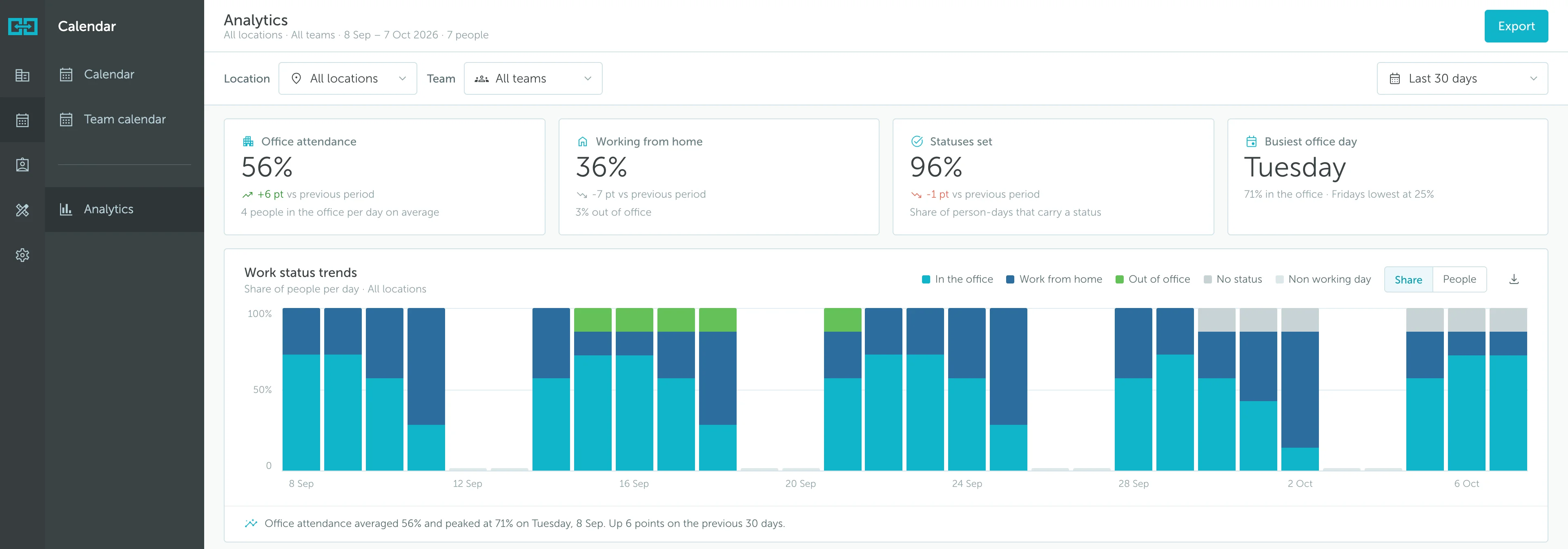
Go to Calendar → Analytics. Use the filters at the top to choose the scope of the report:
- Location: Review all locations or focus on a specific office.
- Team: Review all teams or narrow the results to a team.
- Date range: Choose the reporting period using the selector on the right, shown as Last 30 days in the example.
The header confirms the selected location, team, dates, and number of people. Check this scope before comparing figures or exporting results.
Note: Calendar analytics is based on Calendar work-status planning, not a live count of people physically present. Even where the dashboard uses the term Office attendance, read it as an in-office status measure. Use Workplace analytics to review bookings, check-ins, and no-shows.
Reading the summary
The four cards summarize the selected period:
- Office attendance: The share of person-days with an in-office status, together with the average number of people in the office per day according to their statuses.
- Working from home: The share of person-days with a work-from-home status. The supporting text also shows the out-of-office share.
- Statuses set: The share of person-days that have a status recorded. This helps you understand how complete the planning data is.
- Busiest office day: The weekday with the highest in-office share, with a comparison to the quietest weekday.
Where available, the cards compare results against the previous period. A change expressed in points is a percentage-point difference, not a relative percentage increase. For example, moving from 50% to 56% is an increase of 6 points.
Understanding person-days
Each person counts once per working day. Seven people across 22 working days represent 154 person-days, not 154 different people. Status percentages describe how those person-days are distributed.
The dashboard uses each team’s working days. Weekends can count for teams that work them, so do not assume every report follows a Monday-to-Friday schedule.
Check Statuses set before drawing conclusions about office or remote work. No status means no planning status was recorded; it does not mean the person was absent. Encourage teams to keep their work statuses up to date for more useful comparisons.
Work status trends
The stacked chart shows the daily distribution of In the office, Work from home, Out of office, and No status. The legend also identifies Non working day shading.
Use the controls above the chart to switch between:
- Share: Compare the proportion of people with each status.
- People: View the distribution as counts of people rather than percentages.
Hover over a day to inspect its breakdown. The text below the chart summarizes average office attendance, the peak date, and the comparison with the previous period when available.
In the example, office attendance averages 56%, with peaks around 71%. The recurring drops on Fridays are easier to understand when read alongside the weekday view below.
Use this chart to distinguish a one-off change from a repeated pattern. A single busy day may reflect a team gathering, while consistently higher in-office shares on the same weekdays suggest a regular hybrid work routine.
Work status by weekday
This grid summarizes the share of people with each status for each weekday. Darker cells indicate higher values within that row, helping you compare the same status across the week.
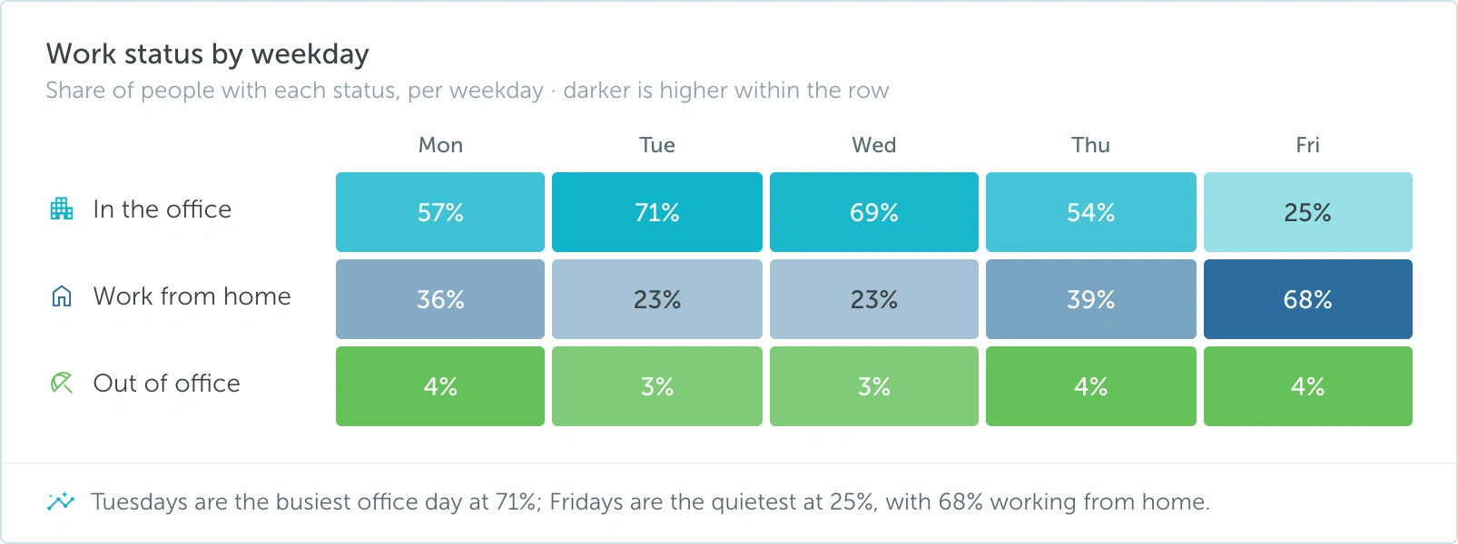
In the example, Tuesday has the highest in-office share at 71%, while Friday has the lowest at 25% and a work-from-home share of 68%.
Read the percentages as well as the color intensity. The grid shows office, remote, and out-of-office statuses; missing statuses and rounding can mean the displayed values for a weekday do not add up to exactly 100%.
This view is useful for identifying suitable days for office collaboration and understanding which days tend to have more remote work. It describes the selected period, rather than predicting future attendance.
Office days per week
This chart groups people by how often they come into the office according to their statuses, averaged over the period. The groups range from Never to 5 days, with a person count and percentage beside each group.
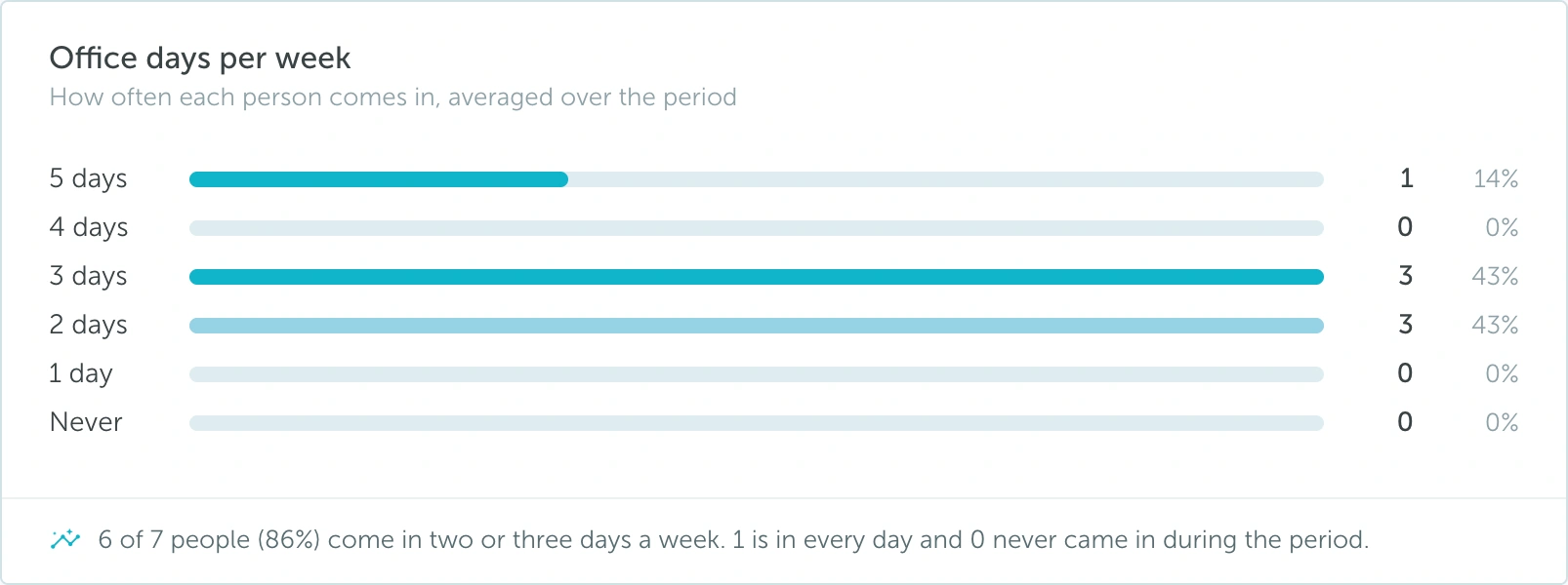
In the example, 6 of 7 people (86%) fall into the two-or-three-days-a-week groups. The summary underneath explains the most notable part of the distribution.
Use this chart to understand how a similar overall office attendance figure can come from different habits. A team where most people plan two or three office days has a different pattern from one split between fully remote and mostly office-based people.
Because the chart summarizes the period, a person’s group does not mean they followed exactly the same schedule every week. Also consider missing statuses before interpreting the Never group as a definite absence from the office.
Actual vs. Guidance
This section compares recorded office-day patterns with the recommended office days configured for teams. It helps distinguish the hybrid pattern shown by the data from the guidance the organization has set.
If no team in the selection has guidance, the dashboard shows No team in this selection has guidance instead of a compliance result. This is a configuration state, not a 0% result.
To make this comparison useful, review the selected teams’ recommended office days and ensure their work statuses are being recorded consistently. See Enabling work statuses per team for the related team setup.
The comparison remains based on work-status planning; it should not be treated as independent proof of physical attendance.
Location work statuses
The location table brings together the number of people and the distribution of their statuses. It includes In the office, Work from home, Out of office, and No status, with a total row underneath.

The colored distribution bar provides a quick comparison, while the percentages make differences easier to quantify. The section also shows the number of locations and working days represented.
Click a location name to explore its breakdown. Use the table’s column controls to compare the figures that matter to your review.
When comparing locations, keep the reporting period and team selection consistent. Read the people count and missing-status share alongside the percentages: a small office with incomplete planning data may not be directly comparable to a larger office where everyone records a status.
Exporting the results
Use Export in the top-right corner of the dashboard to access the report’s export action. The Work status trends chart also has a download button labeled Download CSV.
- Select the location, team, and reporting period.
- Review the header to confirm the scope.
- Check the missing-status share so you understand the completeness of the results.
- Use Export for the dashboard’s export action, or Download CSV on the trend chart for its data.
When sharing results, include the reporting period and explain that these figures describe Calendar work statuses, rather than booking utilization or check-in activity.